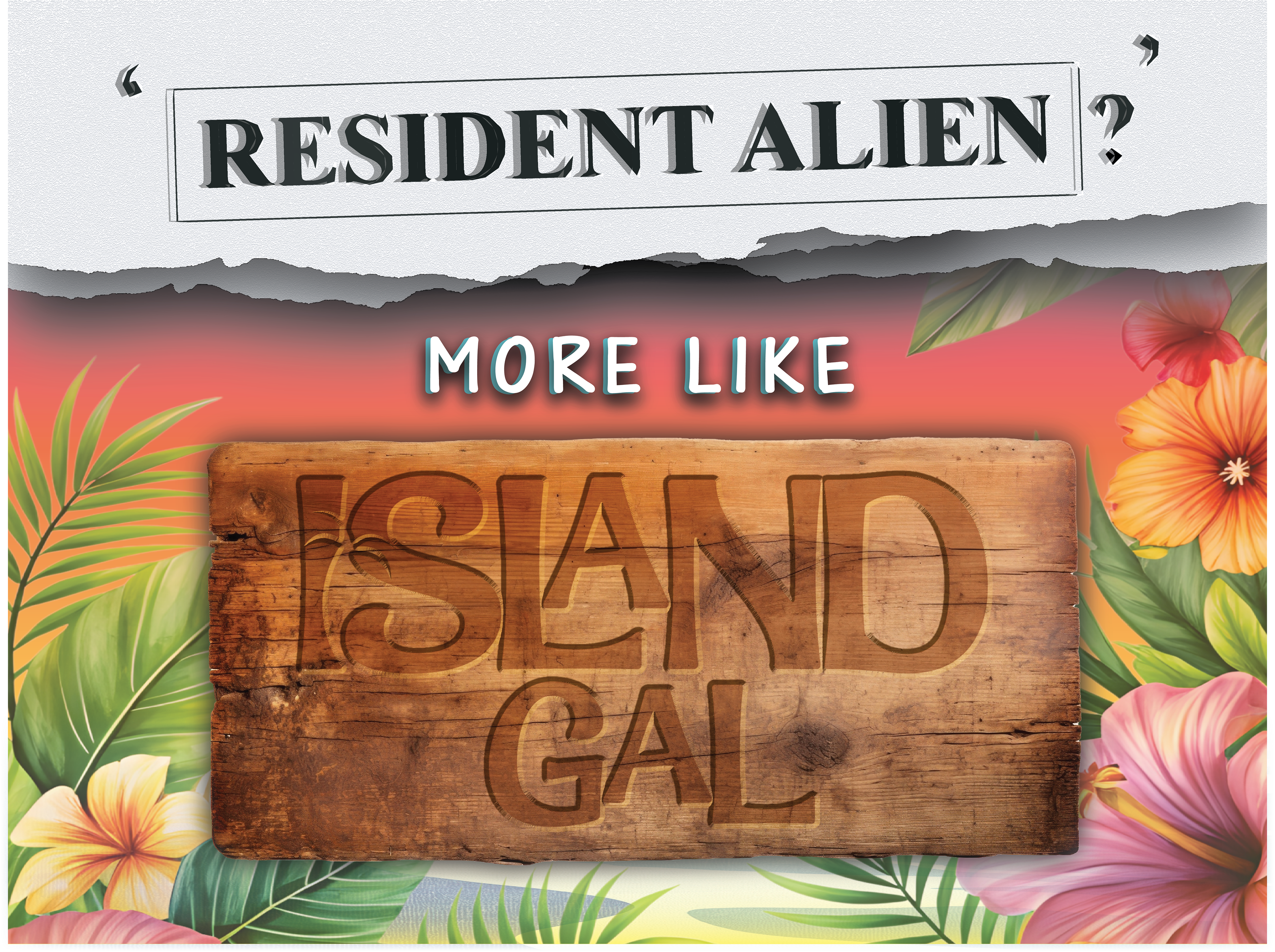
For this project, we were tasked with designing a poster that visually interprets a personal six-word memoir using typography as the primary medium, with minimal imagery and selective color use to enhance meaning. The objective was to explore emotional resonance and narrative through type while applying core design principles such as contrast, hierarchy, and balance. My memoir, Resident Alien? More Like Island Gal, reflects a personal experience of identity and belonging. The final design contrasts the sterile, institutional tone of Resident Alien with the warmth and cultural pride of Island Gal, using torn paper, bold serif type, tropical elements, and wood textures to create a compelling, typographically driven visual statement.