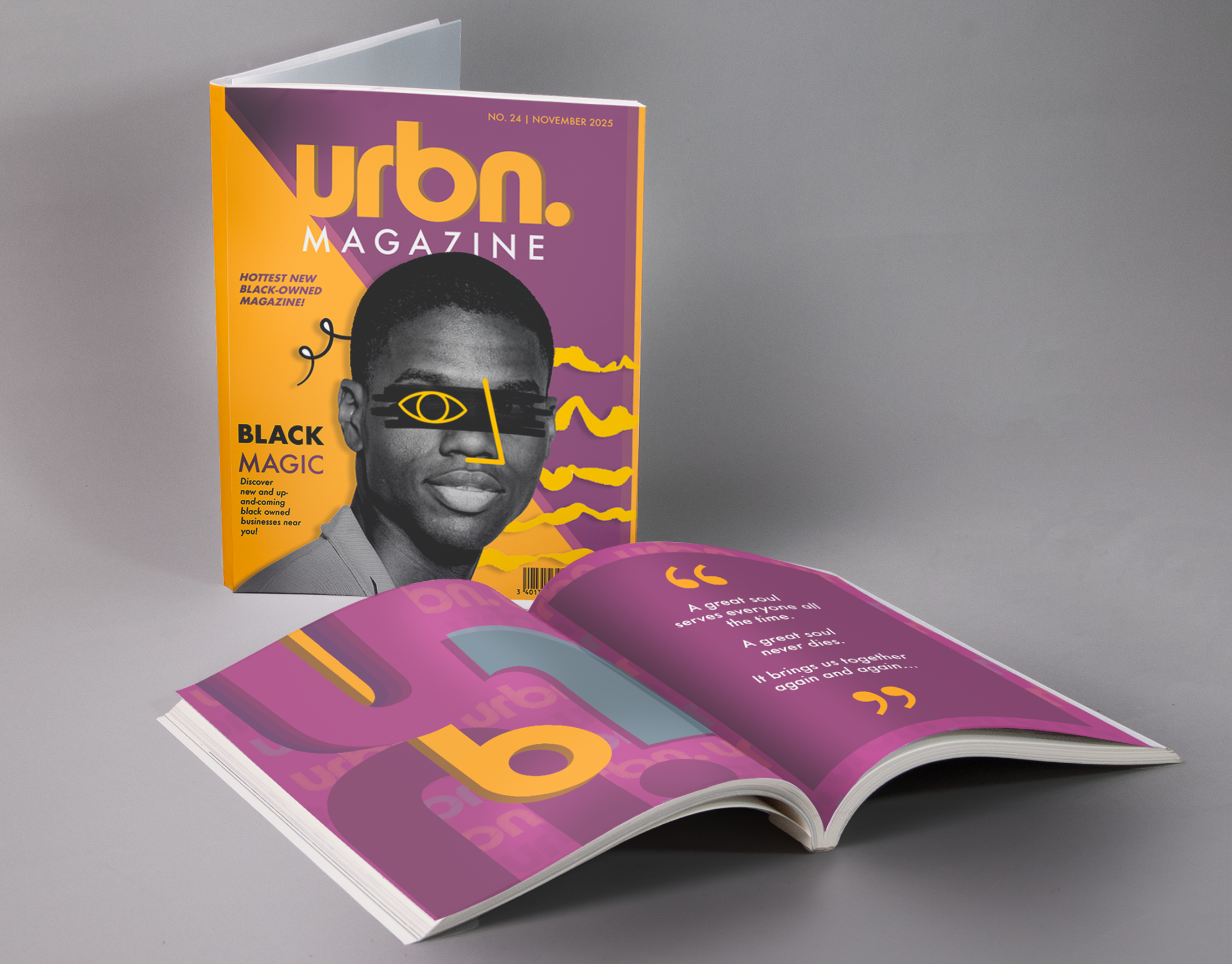
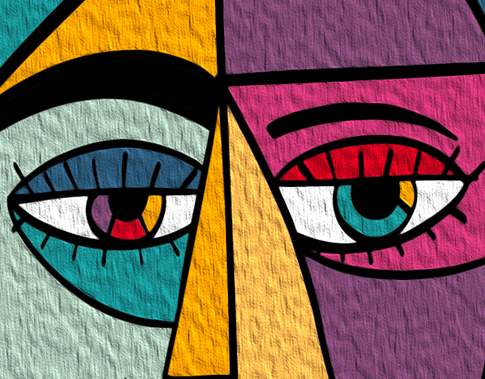
To bring awareness on how color is perceived to various disabilities/illnesses, a design poster for the campaign, “WAKE UP”, portrays how color is perceived to those with autism. The use of bright colors and erratic letter form symbolizes how these particular hues of colors may have harsh effects.


