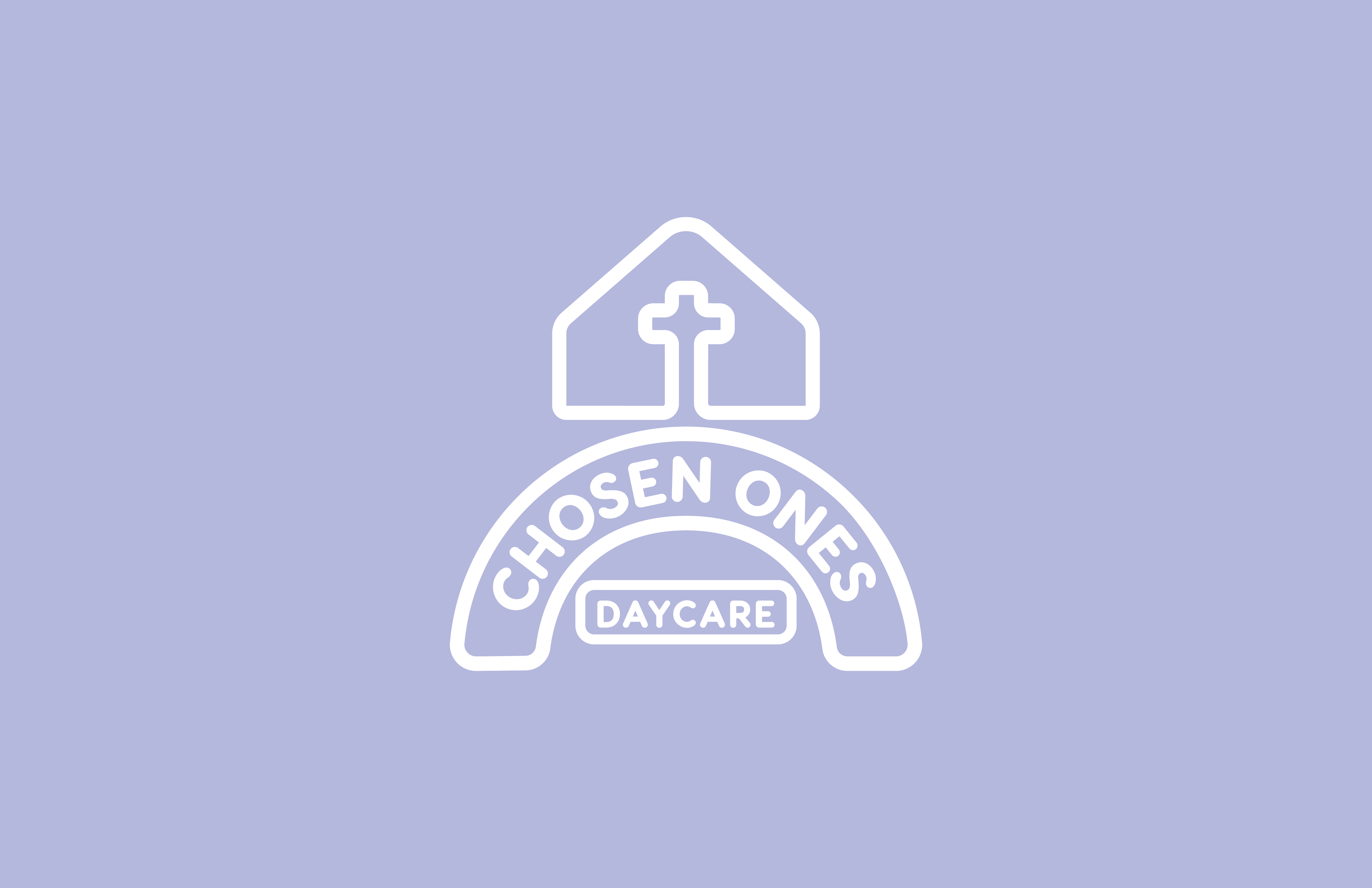
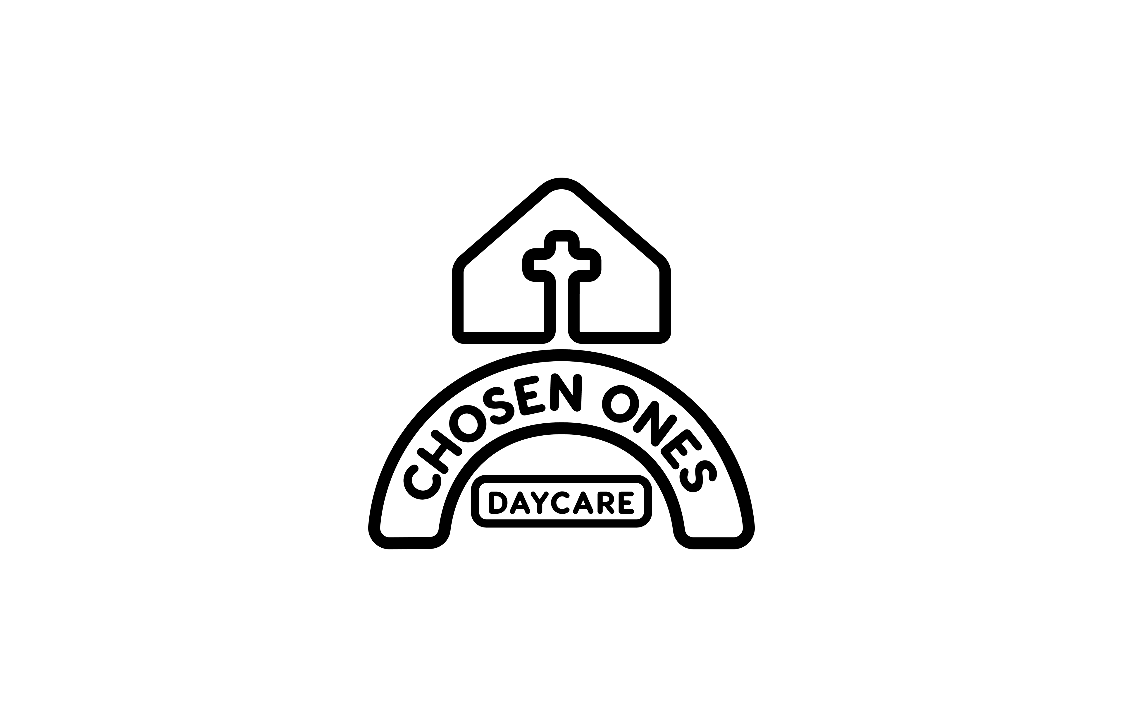
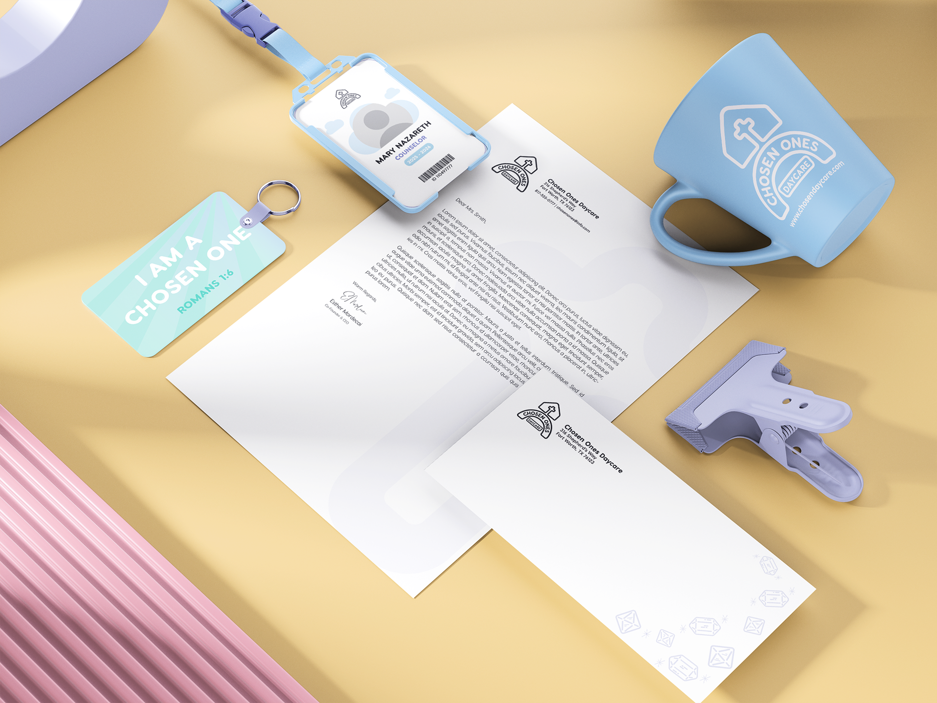
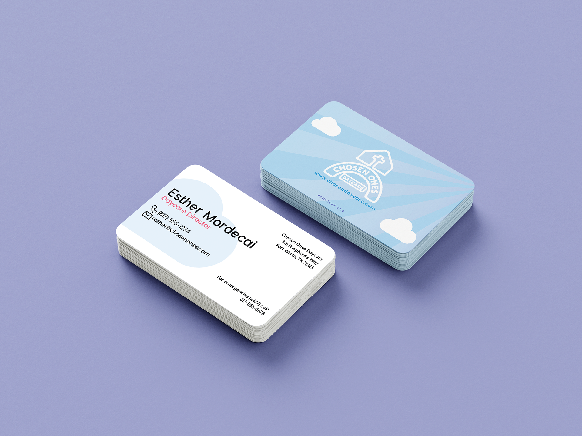
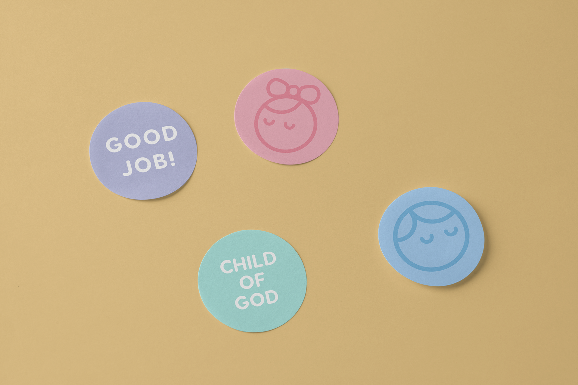

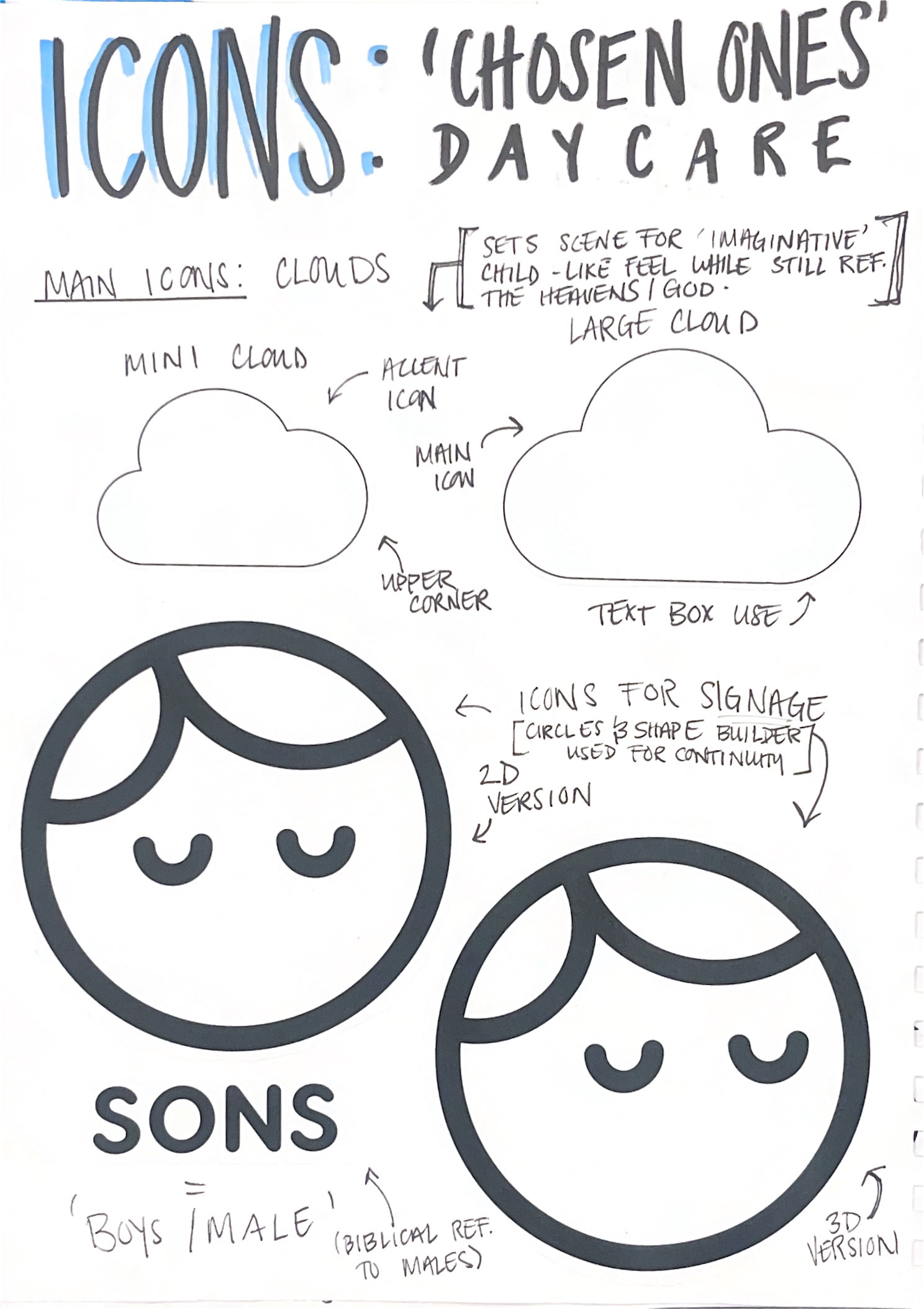
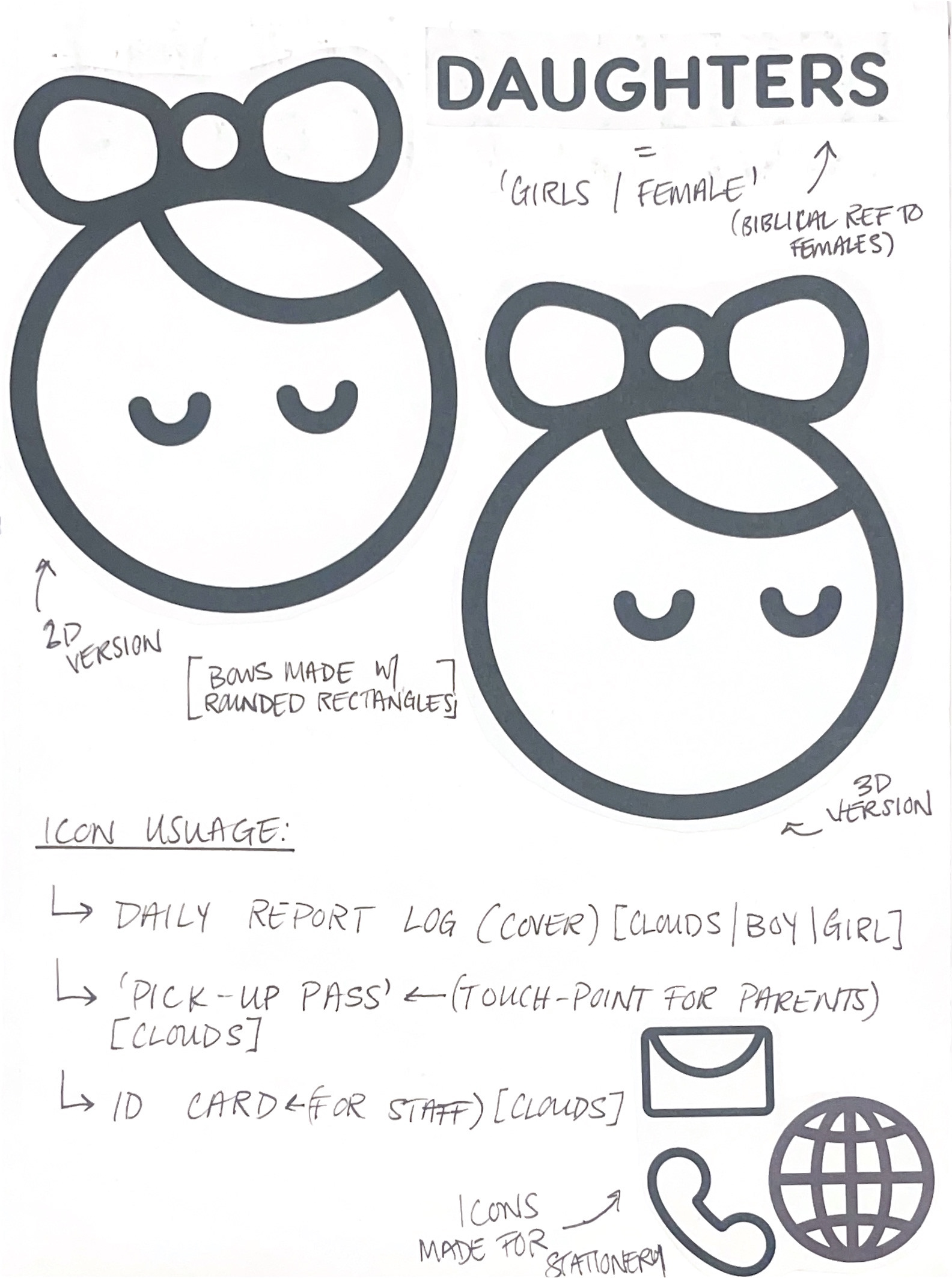
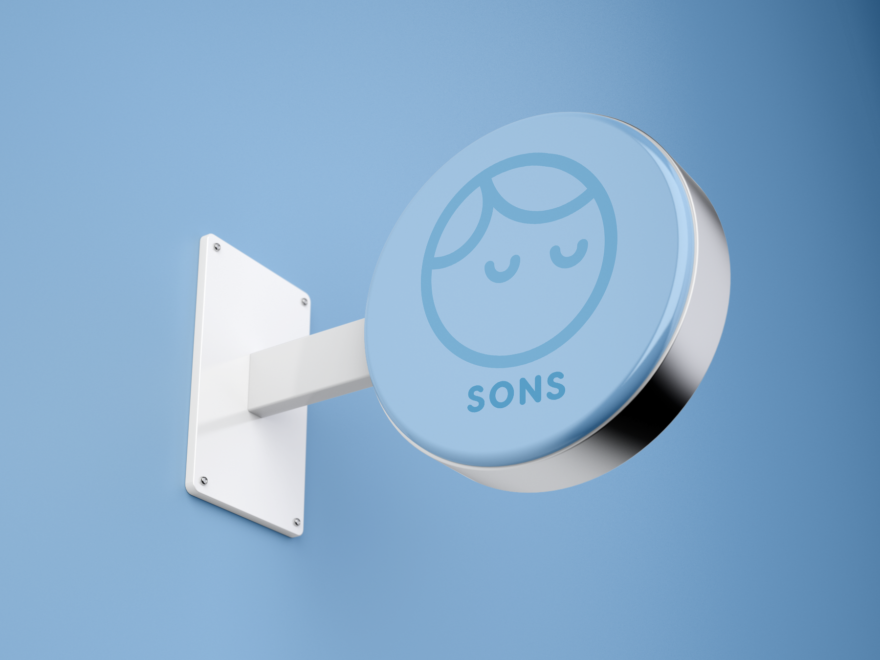
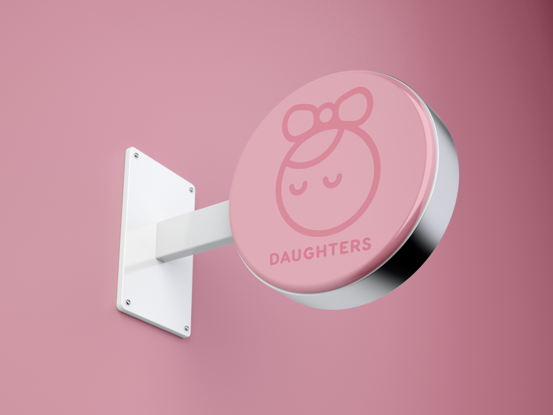
A unified visual identity system, including mockups of stationery, a logo, and business cards, was created by me for the branding project at Chosen Ones Daycare. The design was inspired by Christian values of faith, compassion, and community. These were embodied via the use of inviting, kid-friendly typeface and warm colors. To emphasize the brand's nurturing tone and mirror biblical principles, round forms were purposefully utilized throughout the visual system to represent gentleness and meekness. The spiritual component was further emphasized by the creative labeling of the restroom signage as "Sons" and "Daughters." The presentation was meticulously planned down to the last detail, taking into account typographic hierarchy, spacing, and alignment. To give the brand a more polished and professional look, the mockups incorporated features like foil stamping and die cuts, and the system was made to handle full-color printing with bleeds.